Two fonts are used:
#1. Roboto and #2. Dosis
1. Find "https://fonts.google.com"
2. Copy and replace Google code in header.

CSS variables are used for colours. Colour values are defined in custom.css and can be easily changed to your desired brand colours.
/** ========= GLOBAL STYLES ========= **/
body {
    --primary-color: #1f12fd;
    --primary-text-color: #fff;
    --heading-color: #333;
    --text-color: #767676;
    background-image:url(../images/main-bg.jpg);

}
/** ========= COLORS ========= **/
.sec-bg-light-blue{background-color:#f7fbff;}
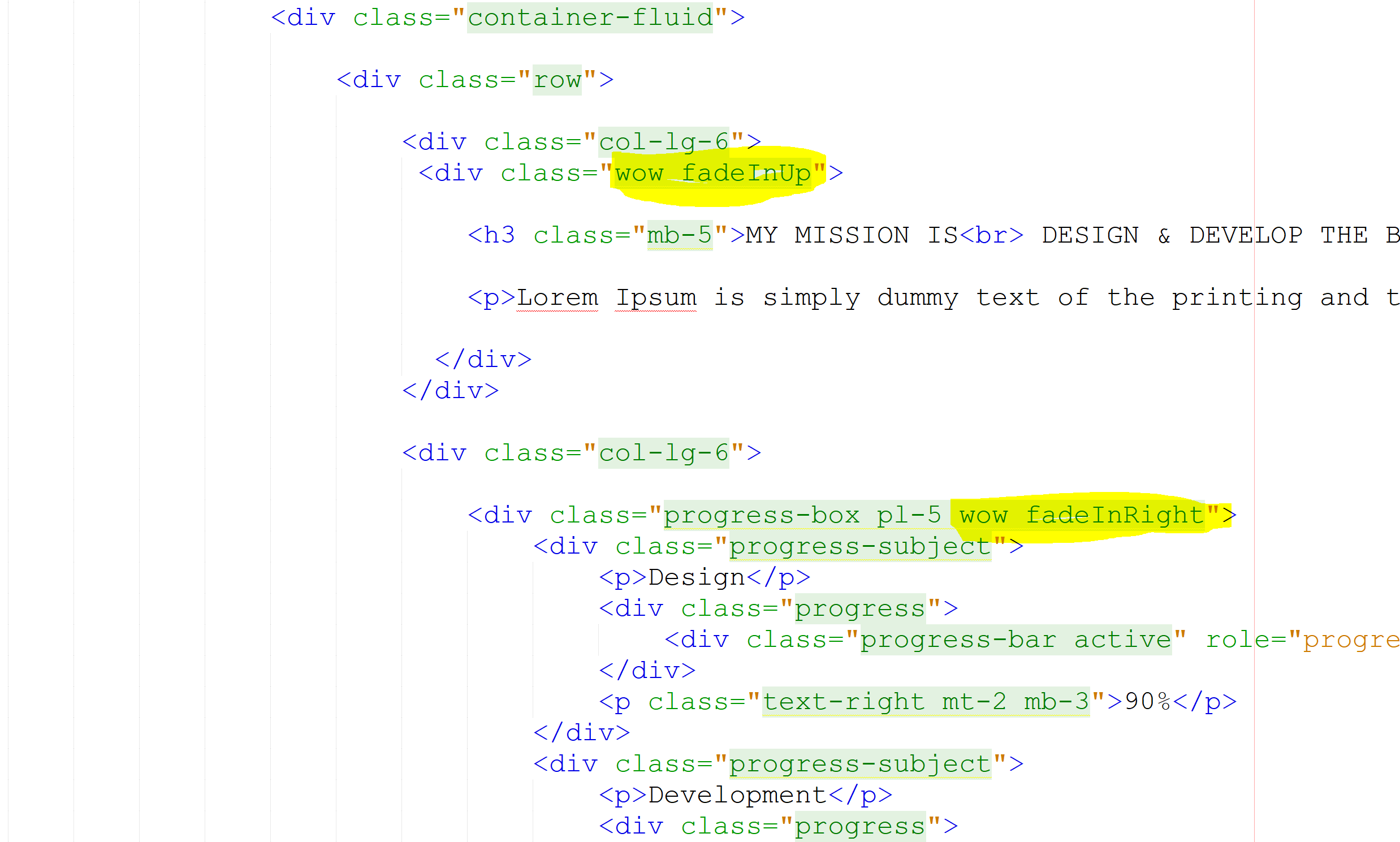
easing
This defines the easing function. Default easing function is 'easeOutExpo'. Please check list of supported
functions here https://api.jqueryui.com/easings/
loop: true
This defines the slider item loop, default duration is true
margin
This defines the carousel items gap, default duration is 50
autoPlay
This determines whether to autoplay. Default value is true
nav
This defines the slider/carousel navigation button. Default value is true
dots
This defines the slider/carousel navigation dots. Default value is false
smartSpeed: 450
This defines the animation duration in milliseconds, default duration is 450
responsive
This defines the carousel items number by display size.
if ($('.owl-carousel.home-testimonials-slider').length) {
    $('.owl-carousel.home-testimonials-slider').owlCarousel({
        loop: true,
        margin:25,
        autoplay: true,
        nav: false,
        dots: true,
        smartSpeed: 450,
        responsive: {
            0: {
                items: 1
            },
            767: {
                items: 2
            },
            1200: {
                items: 3
            }
        }
    });
}
To change the animation, just a class change is required.
Please check the the list of animations available here
Reorder and filter items with a nice shuffling animation. At the very basic level, this replaces one collection of items with another.
Please follow the HTML structure to implement it.
 <ul class="gallery-tab-menu">
    <li class="active"><a href="javascript: void(0);" data-filter="*">All</a></li>
    <li><a href="javascript: void(0);" data-filter=".WebDevelopment">Web Development</a></li>
    <li><a href="javascript: void(0);" data-filter=".Technology">Technology</a></li>
    <li><a href="javascript: void(0);" data-filter=".Office">Office</a></li>
 </ul>
 <div class="grid">
    <div class="grid-item WebDevelopment"><a href="images/blog-img1.jpg" class="full-screen-btn superLightBox"><i class="fas fa-expand-arrows-alt"></i></a><img src="images/blog-img1.jpg" alt="blog-img1" data-tilt></div>
    <div class="grid-item Technology"><a href="images/blog-img2.jpg" class="full-screen-btn superLightBox"><i class="fas fa-expand-arrows-alt"></i></a><img src="images/blog-img2.jpg" alt="blog-img2" data-tilt></div>
    <div class="grid-item Office"><a href="images/blog-img3.jpg" class="full-screen-btn superLightBox"><i class="fas fa-expand-arrows-alt"></i></a><img src="images/blog-img3.jpg" alt="blog-img3" data-tilt></div>
    <div class="grid-item WebDevelopment"><a href="images/blog-img4.jpg" class="full-screen-btn superLightBox"><i class="fas fa-expand-arrows-alt"></i></a><img src="images/blog-img4.jpg" alt="blog-img4" data-tilt></div>
    <div class="grid-item Technology"><a href="images/blog-img5.jpg" class="full-screen-btn superLightBox"><i class="fas fa-expand-arrows-alt"></i></a><img src="images/blog-img5.jpg" alt="blog-img5" data-tilt></div>
    <div class="grid-item Office"><a href="images/blog-img6.jpg" class="full-screen-btn superLightBox"><i class="fas fa-expand-arrows-alt"></i></a><img src="images/blog-img6.jpg" alt="blog-img6" data-tilt></div>
 </div>
In the 3rd UL the "data-buttonclass" attribute can be anything. But the attribute value should be applied as class value to the respective sort type buttons. In the above example the attribute value is “gracesortbut”.
So the sort type button elements have the class “gracesortbut”, which identifies the sort type buttons. Each sort button should contain the attribute “data-sorttype”, which is the class name of the sortable elements.
Each sort button must contain a single class name. And the class name should be applied to the sortable elements.
In case if an element belongs to multiple groups then multiple sort type classes can be applied to it.
In the example let’s consider “price”, “tech” and “other” are the groups. Elements having multiple classes are belongs to multiple groups (class=”price tech”).
In each sortable element there is an attribute "data-rel" in the anchor tab. The value of the "data-rel" attribute is the popup ID of the respected sortable element. The popup data is hidden in the 1st UL. When the sortable elements are clicked respective popup will open.
Attributes
data-duration
How long the animation will take. In milliseconds.
Default 700
Accept Number
Example atduration=”750”
data-easing
Easing for the animation. Use jQuery easing plugin for more easing options.
Default swing
Accept 'swing', 'easeInQuad', 'easeOutQuad', 'easeInOutQuad', 'easeInCubic', 'easeOutCubic',
‘easeInOutCubic', 'easeInQuart', 'easeOutQuart', 'easeInOutQuart', 'easeInQuint', 'easeOutQuint',
'easeInOutQuint', 'easeInSine', 'easeOutSine', 'easeInOutSine', 'easeInExpo', 'easeOutExpo',
'easeInOutExpo', 'easeInCirc', 'easeOutCirc', 'easeInOutCirc', 'easeInElastic', 'easeOutElastic',
'easeInOutElastic', 'easeInBack', 'easeOutBack', 'easeInOutBack', 'easeInBounce', 'easeOutBounce' and
'easeInOutBounce'.
Example ateasing=”easeInQuad”
data-autoheight
Adjusts the height of container to fits all the items, 'auto' for automatically adjusting before or after
the animation (determined automatically), 'dynamic' for height adjustment animation, false for keeping the
height constant.
Default auto
Accepts auto, dynamic and false
Example atautoheight=”false”
<div class="accordion accordion-flush" id="accordionFlushExample">
  <div class="accordion-item">
    <h2 class="accordion-header">
      <button class="accordion-button collapsed" type="button" data-bs-toggle="collapse" data-bs-target="#flush-collapseOne" aria-expanded="false" aria-controls="flush-collapseOne">
        Accordion Item #1
      </button>
    </h2>
    <div id="flush-collapseOne" class="accordion-collapse collapse" aria-labelledby="flush-headingOne" data-bs-parent="#accordionFlushExample">
      <div class="accordion-body">Placeholder content for this accordion, which is intended to demonstrate the <code>.accordion-flush</code> class. This is the first item's accordion body.</div>
    </div>
  </div>
  <div class="accordion-item">
    <h2 class="accordion-header">
      <button class="accordion-button collapsed" type="button" data-bs-toggle="collapse" data-bs-target="#flush-collapseTwo" aria-expanded="false" aria-controls="flush-collapseTwo">
        Accordion Item #2
      </button>
    </h2>
    <div id="flush-collapseTwo" class="accordion-collapse collapse" aria-labelledby="flush-headingTwo" data-bs-parent="#accordionFlushExample">
      <div class="accordion-body">Placeholder content for this accordion, which is intended to demonstrate the <code>.accordion-flush</code> class. This is the second item's accordion body. Let's imagine this being filled with some actual content.</div>
    </div>
  </div>
  <div class="accordion-item">
    <h2 class="accordion-header">
      <button class="accordion-button collapsed" type="button" data-bs-toggle="collapse" data-bs-target="#flush-collapseThree" aria-expanded="false" aria-controls="flush-collapseThree">
        Accordion Item #3
      </button>
    </h2>
    <div id="flush-collapseThree" class="accordion-collapse collapse" aria-labelledby="flush-headingThree" data-bs-parent="#accordionFlushExample">
      <div class="accordion-body">Placeholder content for this accordion, which is intended to demonstrate the <code>.accordion-flush</code> class. This is the third item's accordion body. Nothing more exciting happening here in terms of content, but just filling up the space to make it look, at least at first glance, a bit more representative of how this would look in a real-world application.</div>
    </div>
  </div>
</div>
<div class="row">
    <div class="col-lg-3 col-md-6">
        <h3 class="numscroller fw-7" data-slno='1' data-min='0' data-max='74389' data-delay='5' data-increment="500">74389</h3>
        <p>Volunteer Around The World</p>
    </div>
    <div class="col-lg-3 col-md-6">
        <h3 class="numscroller fw-7" data-slno='1' data-min='0' data-max='91389' data-delay='5' data-increment="500">91389</h3>
        <p>Money Donated</p>
    </div>
    <div class="col-lg-3 col-md-6">
        <h3 class="numscroller fw-7" data-slno='1' data-min='0' data-max='44389' data-delay='5' data-increment="300">44389</h3>
        <p>People Impacted</p>
    </div>
    <div class="col-lg-3 col-md-6">
        <h3 class="numscroller fw-7" data-slno='1' data-min='0' data-max='885' data-delay='5' data-increment="5">885</h3>
        <p>Positive Feedbacks</p>
    </div>
</div>
<div class="progress">
  <div class="progress-bar" role="progressbar" style="width: 25%;" aria-valuenow="25" aria-valuemin="0" aria-valuemax="100">25%</div>
</div>
<div class="progress">
  <div class="progress-bar" role="progressbar" style="width:50%;" aria-valuenow="50" aria-valuemin="0" aria-valuemax="100">50%</div>
</div>
<div class="progress">
  <div class="progress-bar" role="progressbar" style="width:75%;" aria-valuenow="75" aria-valuemin="0" aria-valuemax="100">75%</div>
</div>
<div class="progress">
  <div class="progress-bar" role="progressbar" style="width:100%;" aria-valuenow="100" aria-valuemin="0" aria-valuemax="100">100%</div>
</div>
<button type="button" class="btn btn-secondary" data-bs-toggle="tooltip" data-bs-placement="top" title="Tooltip on top">
  Tooltip on top
</button>
<button type="button" class="btn btn-secondary" data-bs-toggle="tooltip" data-bs-placement="right" title="Tooltip on right">
  Tooltip on right
</button>
<button type="button" class="btn btn-secondary" data-bs-toggle="tooltip" data-bs-placement="bottom" title="Tooltip on bottom">
  Tooltip on bottom
</button>
<button type="button" class="btn btn-secondary" data-bs-toggle="tooltip" data-bs-placement="left" title="Tooltip on left">
  Tooltip on left
</button>
<div class="alert alert-primary" role="alert">
  This is a primary alert—check it out!
</div>
<div class="alert alert-secondary" role="alert">
  This is a secondary alert—check it out!
</div>
<div class="alert alert-success" role="alert">
  This is a success alert—check it out!
</div>
<div class="alert alert-danger" role="alert">
  This is a danger alert—check it out!
</div>
<div class="alert alert-warning" role="alert">
  This is a warning alert—check it out!
</div>
<div class="alert alert-info" role="alert">
  This is a info alert—check it out!
</div>
<div class="alert alert-light" role="alert">
  This is a light alert—check it out!
</div>
<div class="alert alert-dark" role="alert">
  This is a dark alert—check it out!
</div>
<button type="button" class="btn btn-primary">Primary</button>
<button type="button" class="btn btn-secondary">Secondary</button>
<button type="button" class="btn btn-success">Success</button>
<button type="button" class="btn btn-danger">Danger</button>
<button type="button" class="btn btn-warning">Warning</button>
<button type="button" class="btn btn-info">Info</button>
<button type="button" class="btn btn-light">Light</button>
<button type="button" class="btn btn-dark">Dark</button>
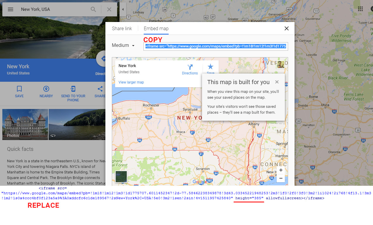
1.Go to google map and search your location. and Copy <iframe> code.
2.Replace it with <iframe> code under contact slide.
3.Make sure width="100%" and height="470".